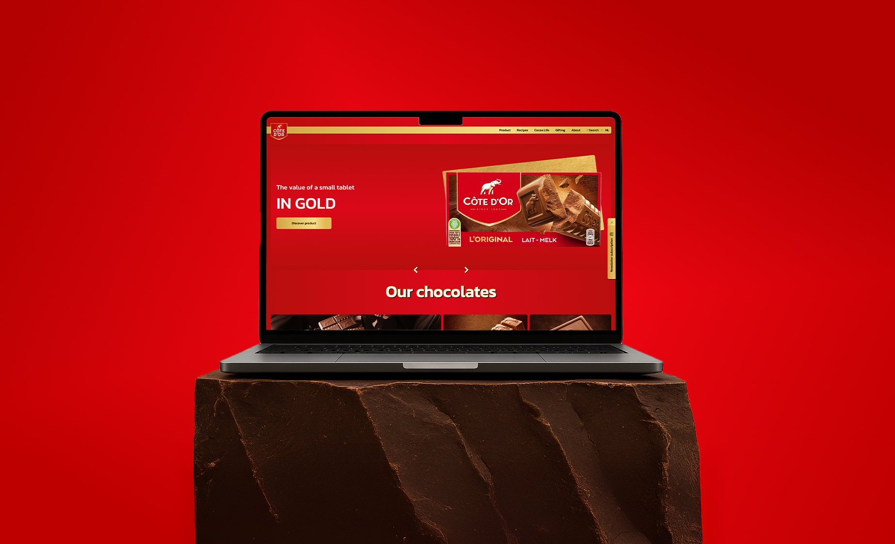
Côte d'Or • UX/UI
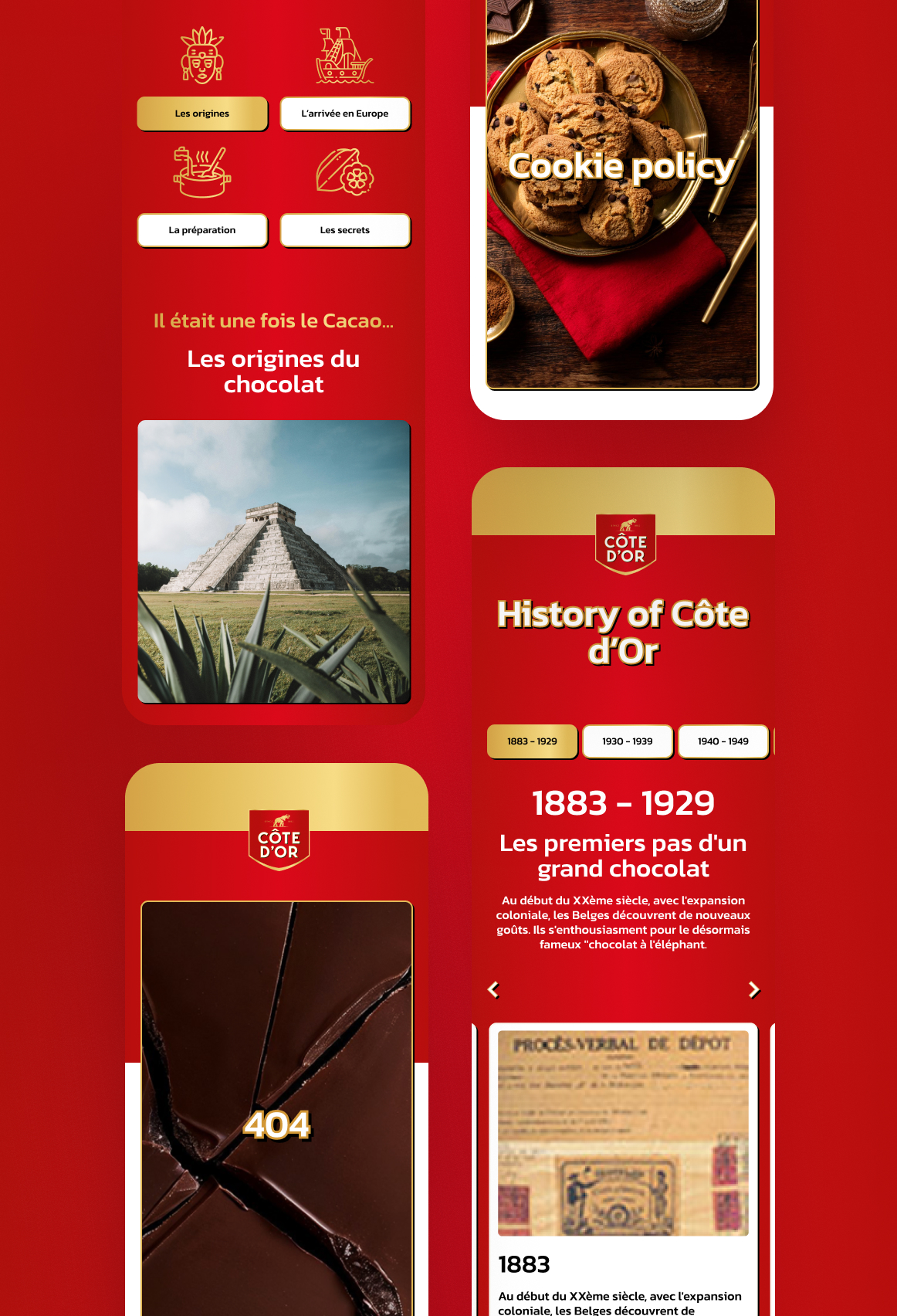
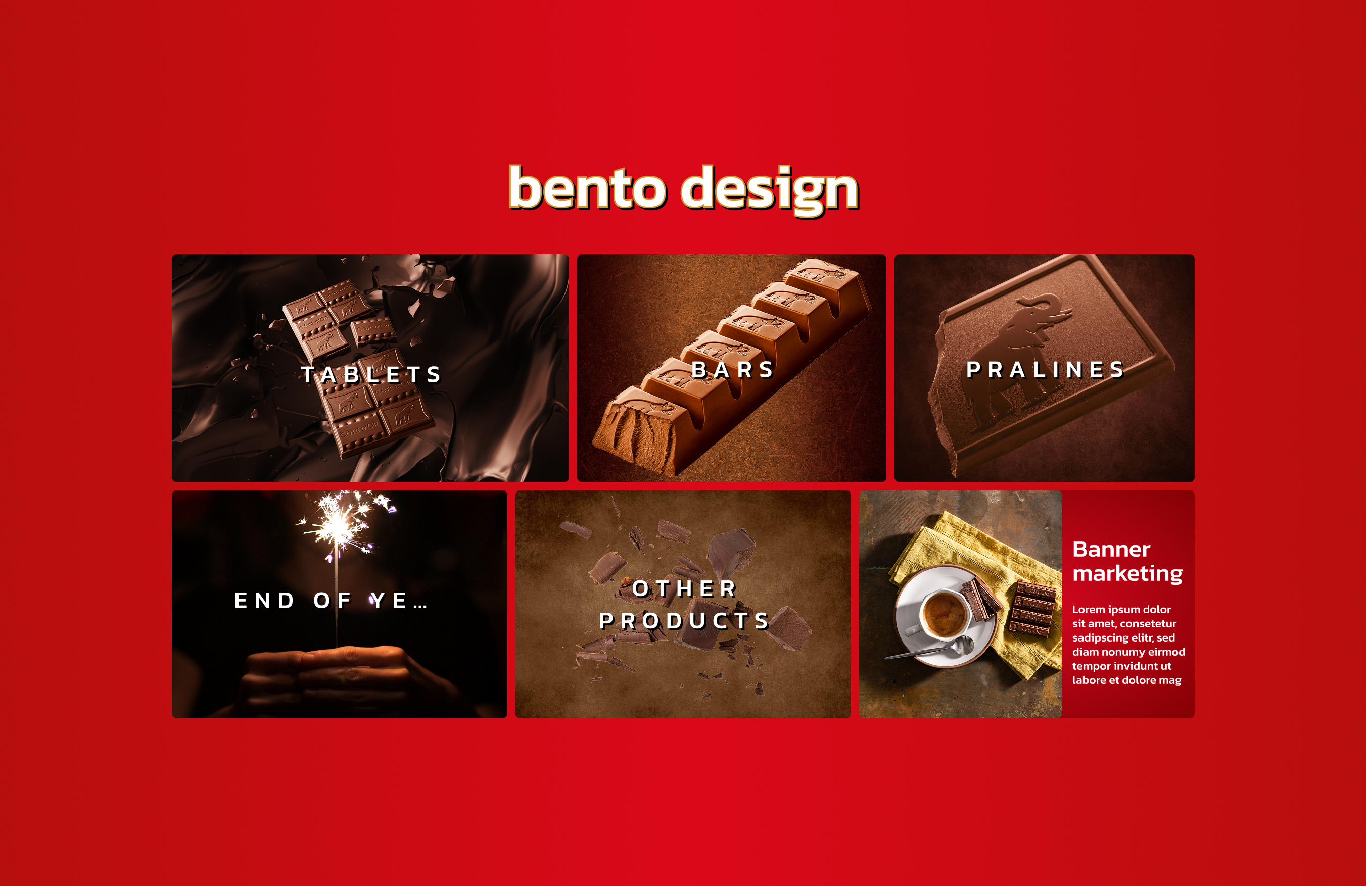
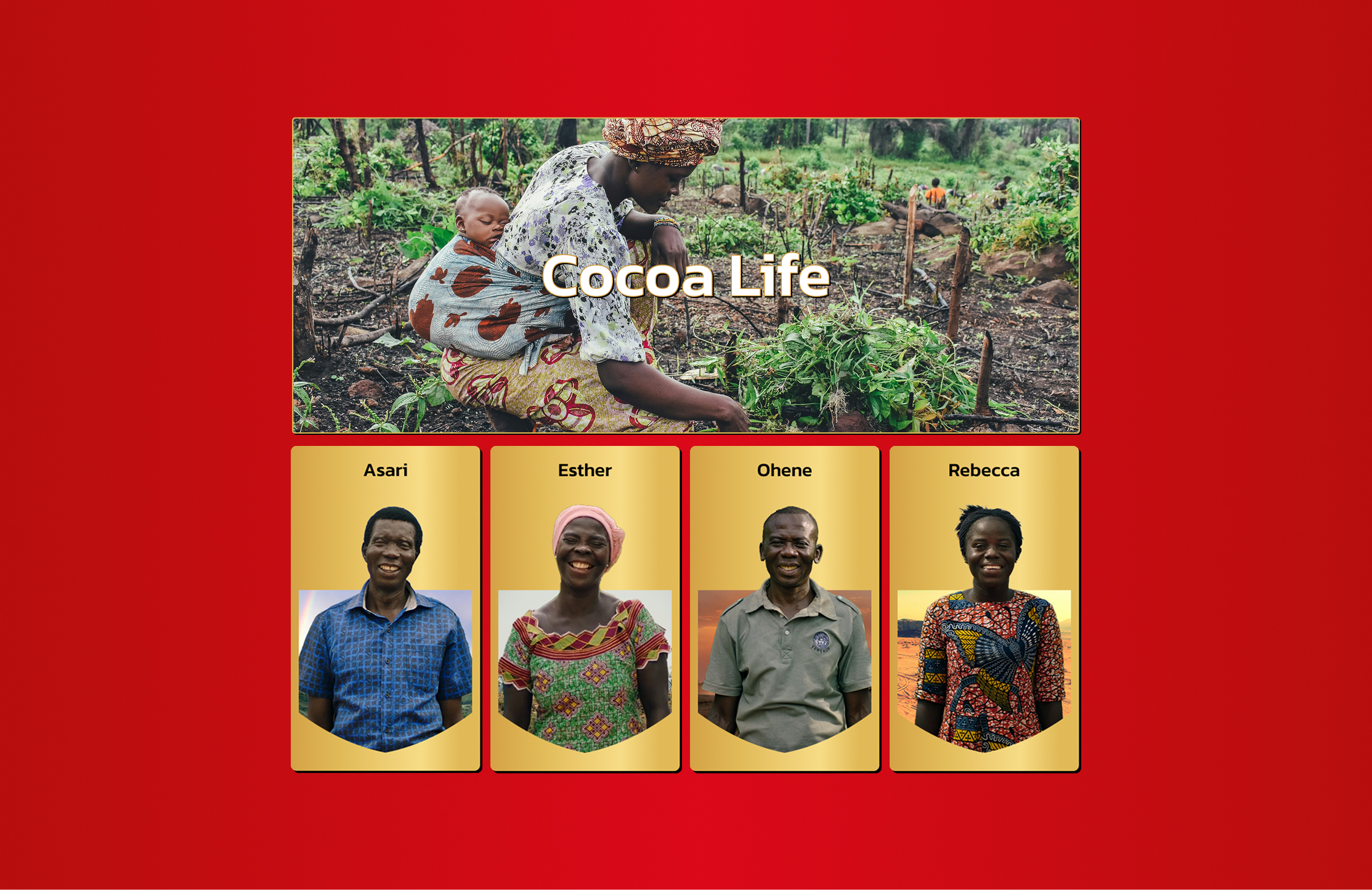
The Côte d'Or team asked us to support them in redesigning their website following the recent refresh of the Côte d'Or logo. Our goal was to align the new website with the updated brand guidelines.We were also tasked with highlighting key elements such as Cocoa Life values, recipes, and products.For the homepage, we drew some inspiration from the Benton design style. Almost all design assets are inspired by the new logo, featuring red and gold gradients, as well as deep black shadows to reinforce the brand's identity.
context
Côte d’Or is a Belgian chocolate brand, part of the Mondelez group.The brand recently went through a logo reshaping and a new visual identity rollout.The existing website was outdated and no longer aligned with the new brand image.
Users:
• Core audience aged 45 to 70
• Loyal and well-established target
• Desire to subtly reach a younger audience
Goal:
• Redesign the website to reflect the new identity
• Modernize the digital presence
• Keep maintenance as low as possible
UX Problem
The website no longer reflected the brand positioning or current design standards and did not support the brand’s evolution.
Main issues:
• Outdated visual language
• Unclear hierarchy and navigation
• Low flexibility for future communication
• Strong maintenance constraints on the client side
UX APPROACH
The UX approach focused on validating navigation and information hierarchy while keeping maintenance and technical constraints in mind.
• No formal UX research due to budget constraints
• Wireframes created to validate navigation and information hierarchy
• Customer journey reviewed at a high level
• Internal testing within the agency
• Reviews and validation with the clientIterative simplification to remove unnecessary or complex features
• UX decisions guided by clarity and maintenance constraints
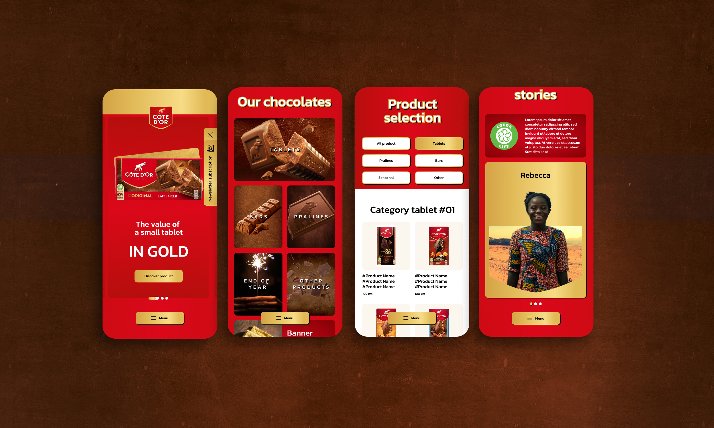
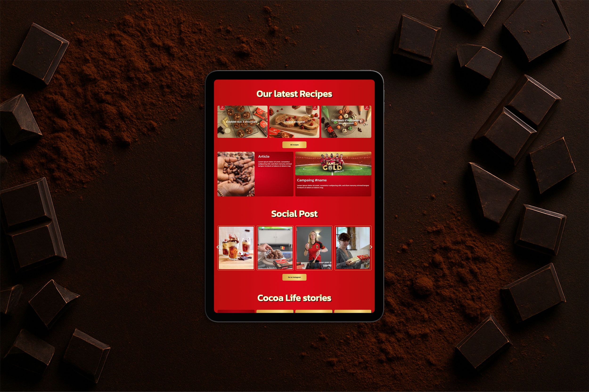
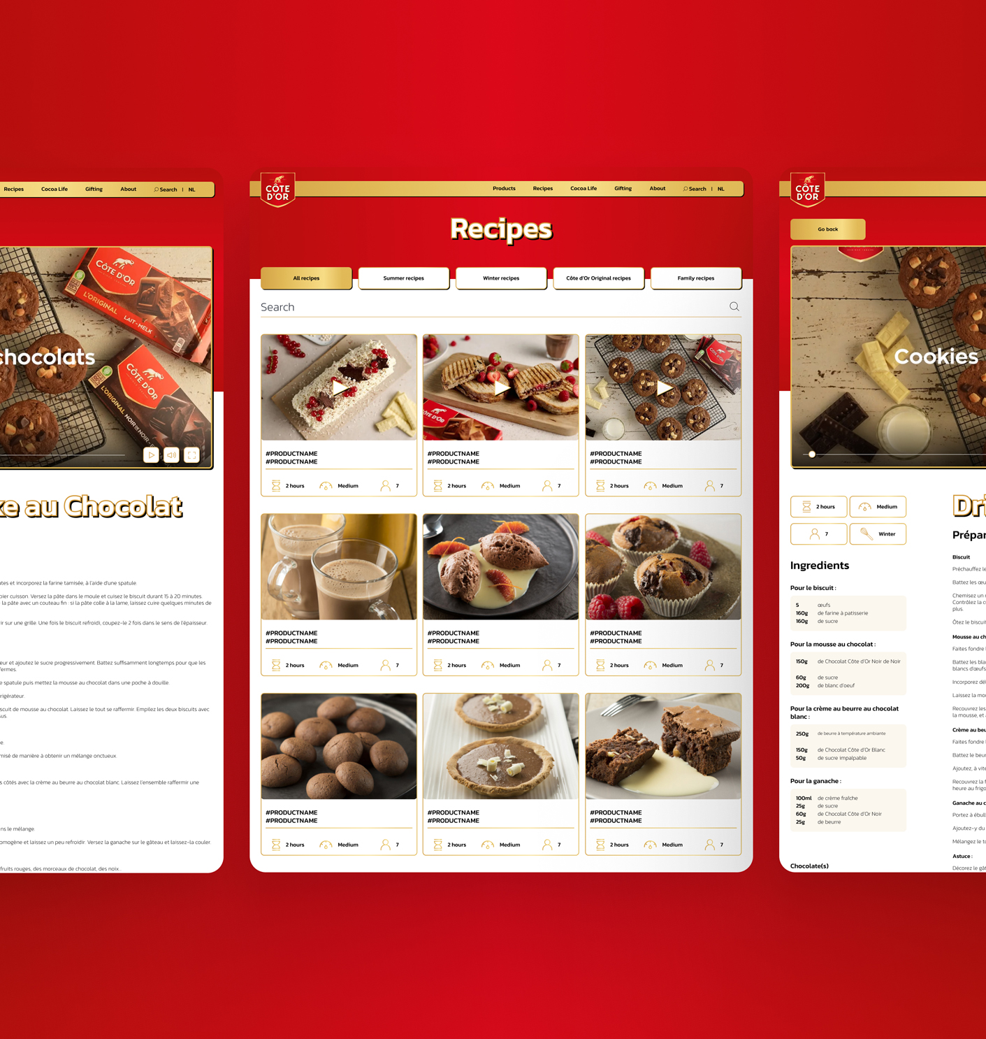
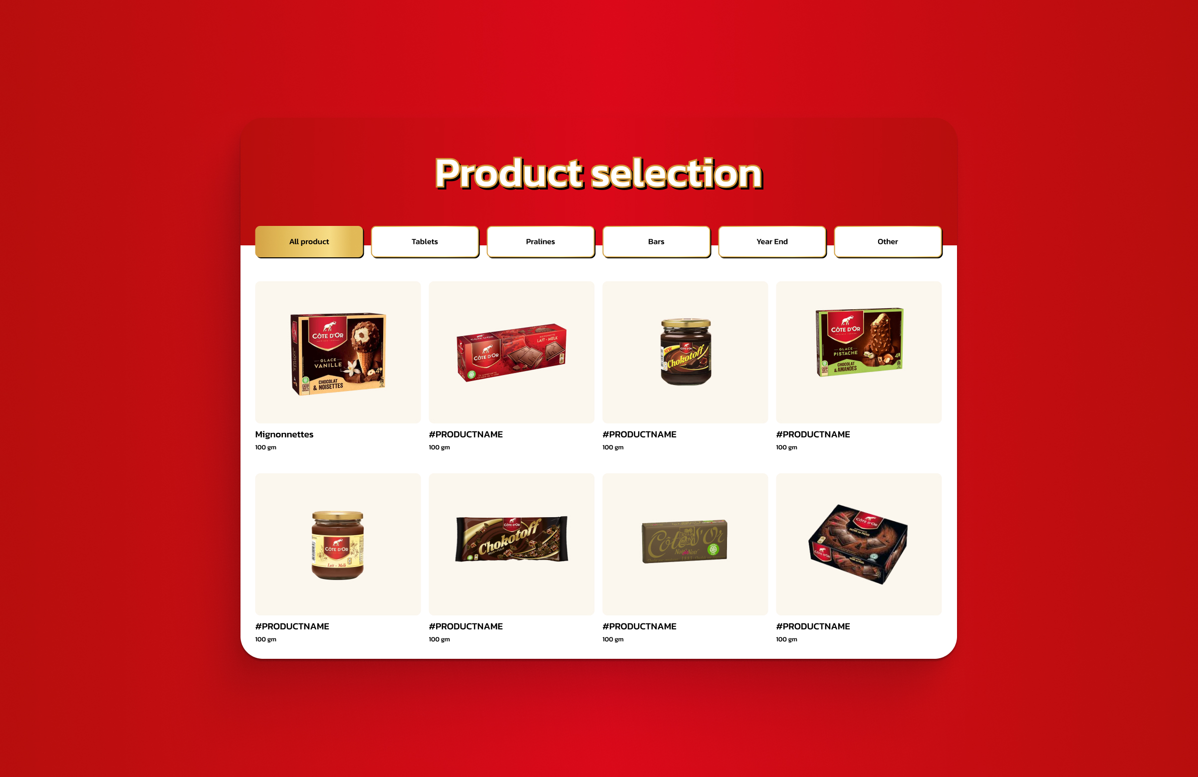
SOLUTION AND UI
Key decisions:
• Brand-focused showcase website
• Clear content prioritization (products, campaigns, contests, commitments, brand history)
• Simplified and intuitive navigation
• Homepage highlighting key news, contests, and newsletter access
• UI aligned with the new visual identity
• Design created in Figma with reusable components and variables
• Flexible bento-style layout
• Responsive design across desktop, tablet, and mobile
DELIVERY AND IMPACT
The project was delivered in close collaboration with developers, ensuring alignment between design intent and technical constraints
• Design delivered across all breakpoints
• Close collaboration with developers during implementation
• Adjustments made due to technical and time constraintse
• Final delivery close to the original design intent
• High client satisfaction regarding visual quality
• High client satisfaction regarding interface clarity